JANJE.COM
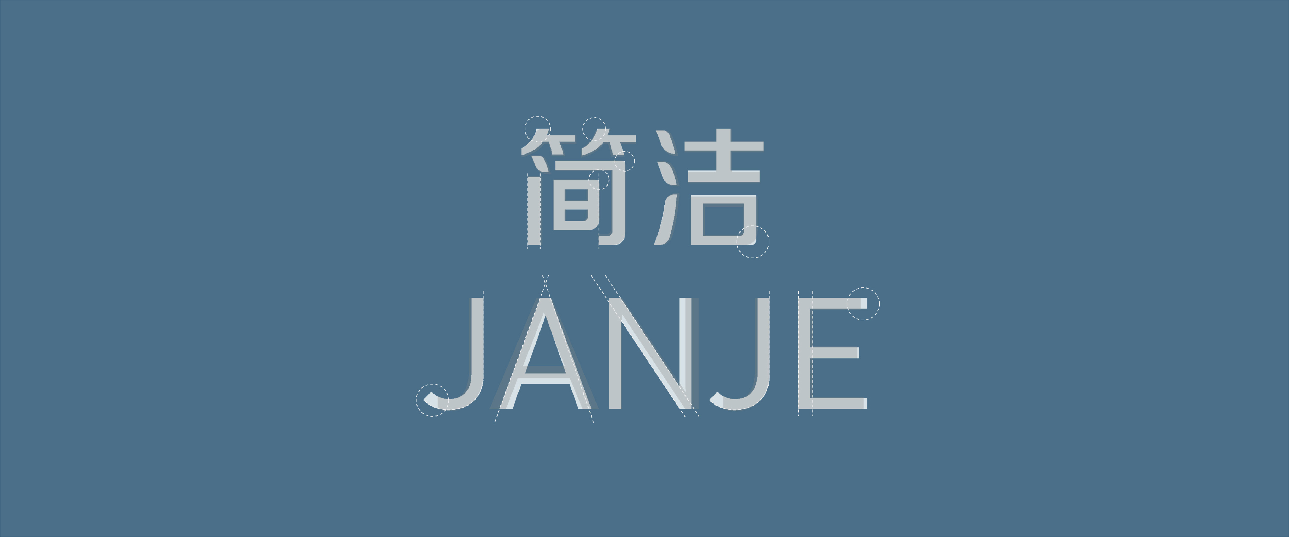
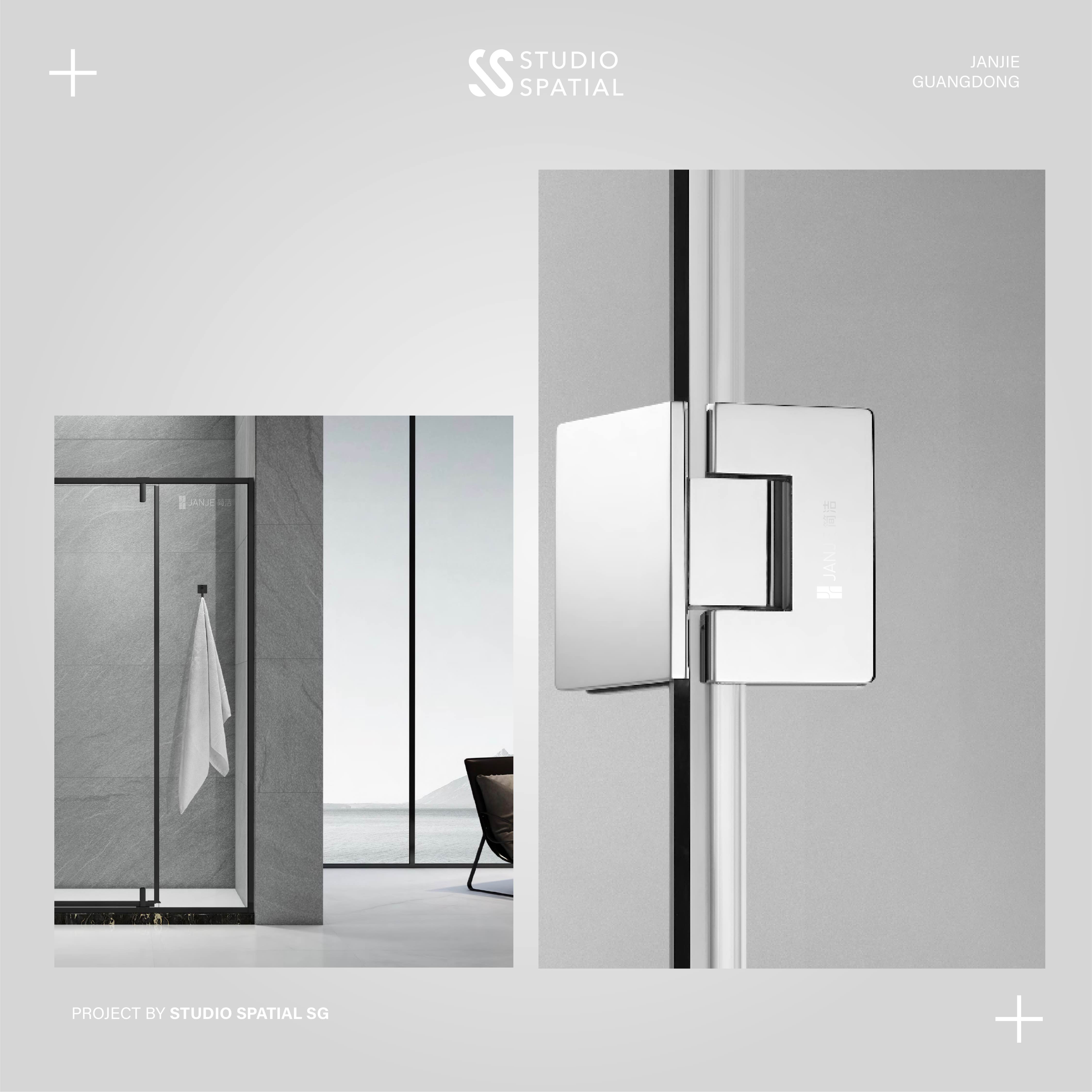
Janje is a leading OEM/ODM manufacturer specializing in shower doors and hardware products. Their reputation is built on precision and quality, making them a trusted partner in the industry. With a strong association with glass and metal, Janje sought to modernize their logo to better reflect their bold and confident brand identity while maintaining a clean and lightweight aesthetic that aligns with their core products.
Service
#Logo Refinement
#Visual Identity
#Business Card
#PPT
Sector
Manufacturer, Supplier
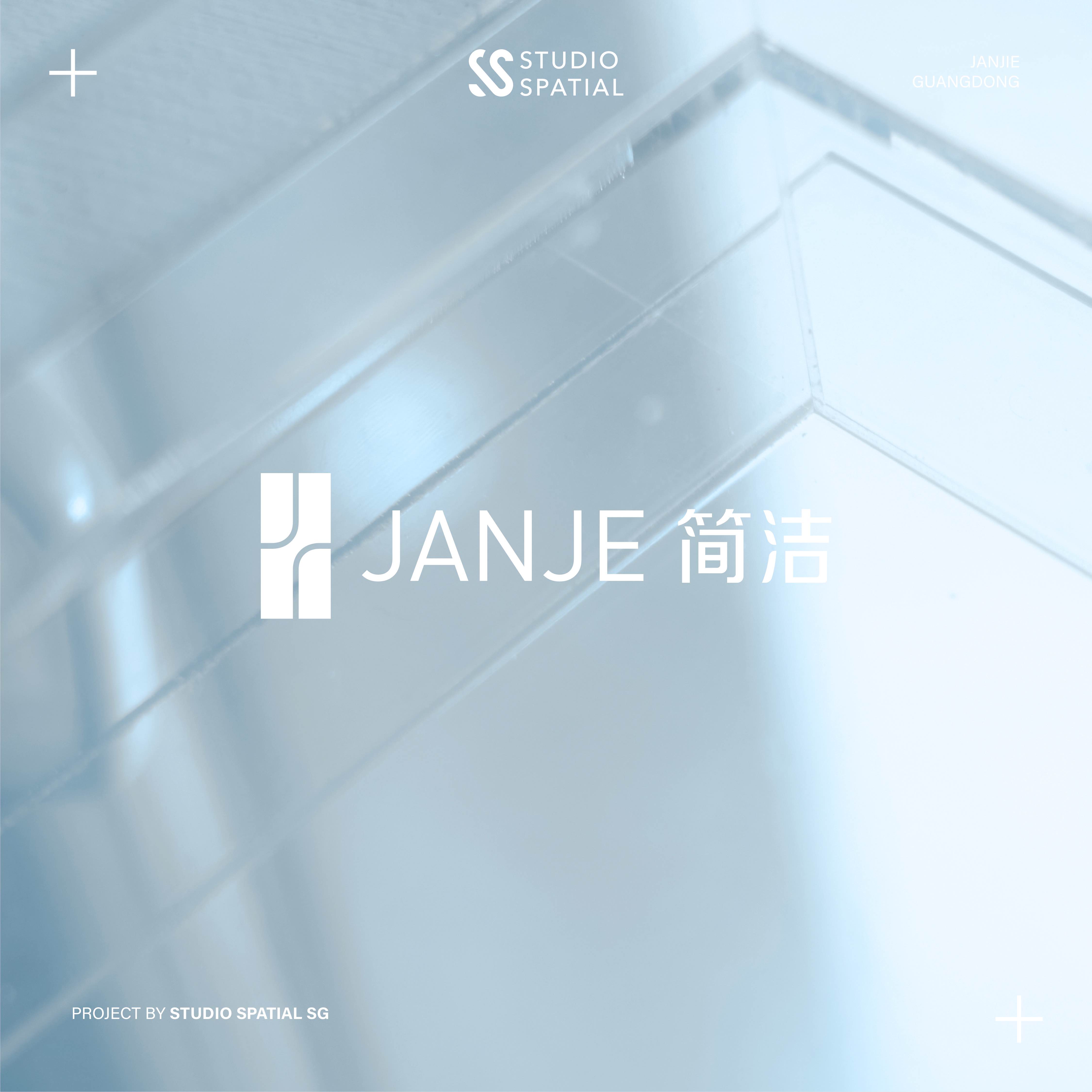
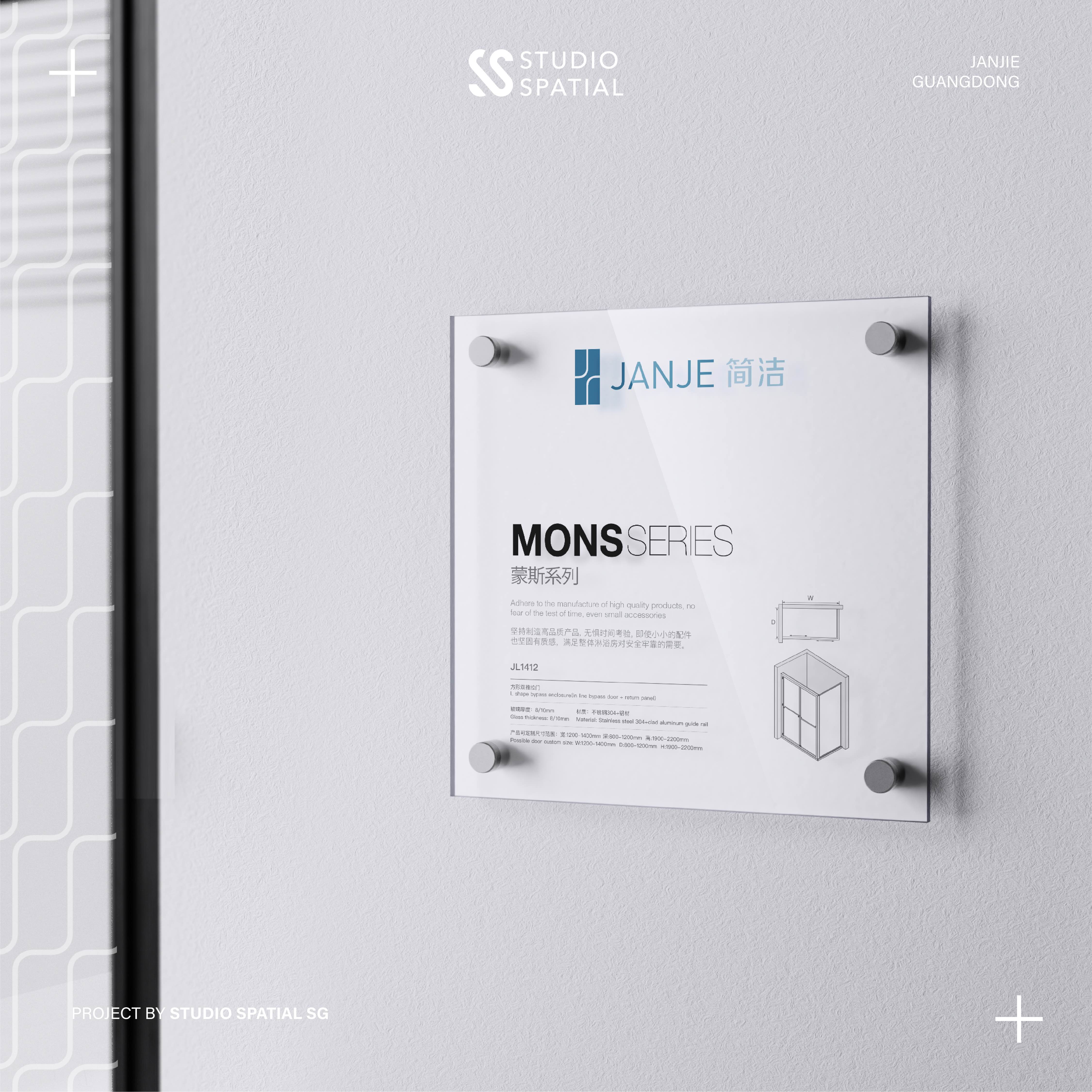
Our task was to refine Janje’s existing logo, enhancing its visual appeal while staying true to its original essence. The updated design incorporates a sophisticated shade of blue to convey boldness, experience, and maturity, steering away from an overly youthful appearance. We repositioned the "J + J" icon to achieve a more balanced weight distribution and refined the transition from thick to thin elements. By aligning the "J" lines with the overall lettering style, we created a logo that feels more modern, sturdy, and trustworthy—perfectly suited to inspire confidence and trust at first glance.