
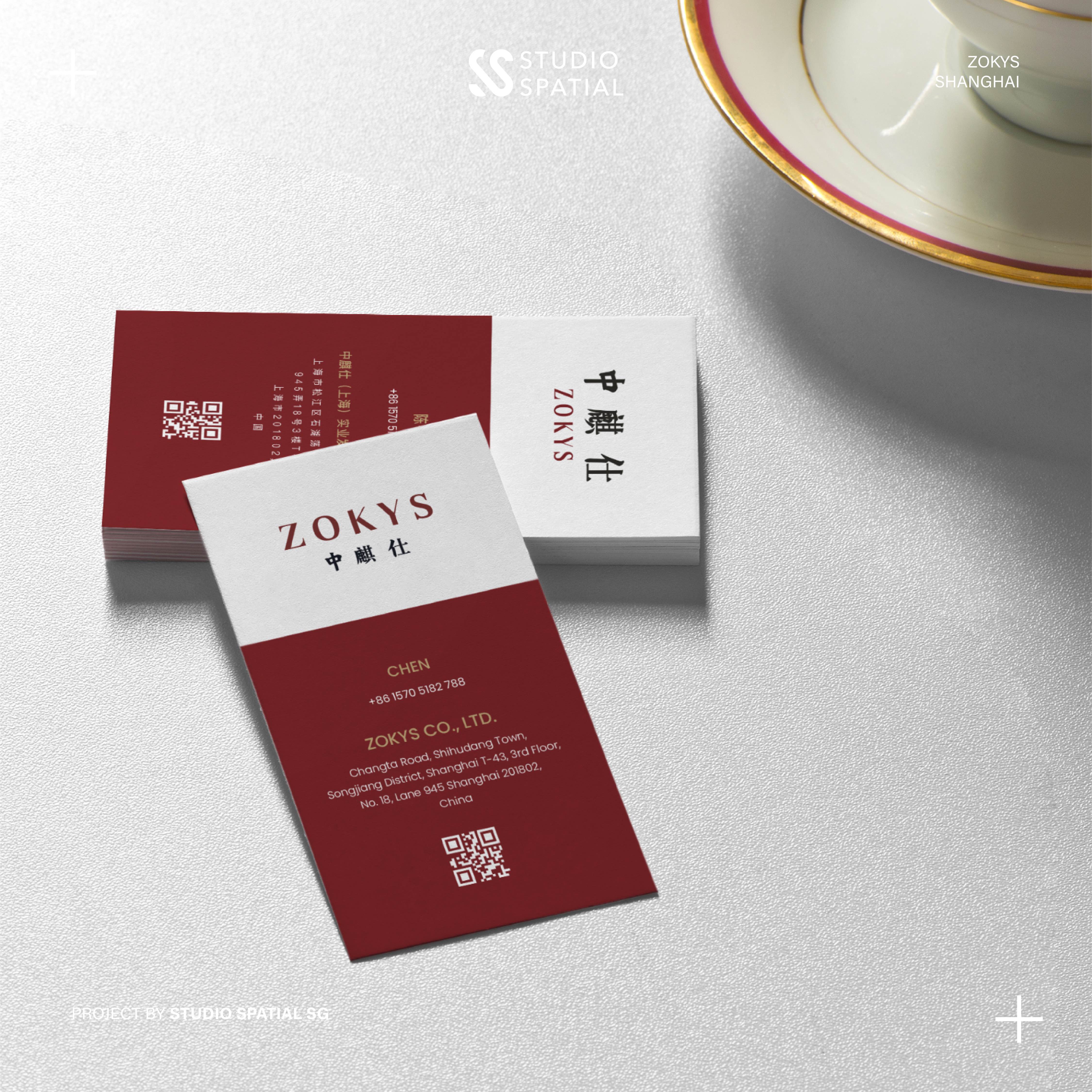
The name ZOKYS stands out for its distinctiveness and charm, leaving a lasting impression on consumers. Unlike generic brand names that fade from memory, ZOKYS is both memorable and unique. Its brilliance lies in its blend of Chinese and English phonetics, making it adaptable for global markets. This seamless cross-linguistic appeal ensures that the name resonates across diverse regions, embodying both the brand's Chinese heritage and its modern, tech-forward identity. ZOKYS captures the essence of a brand that bridges cultures, innovation, and timelessness.
Service
#Naming
#Logo
Service
#Naming
#Logo
Sector
Supplier, Manufature
The ZOKYS logo further emphasizes this balance of tradition and modernity. Drawing inspiration from typography, the logo masterfully combines KaiTi and SongTi typefaces. The KaiTi strokes reflect traditional Chinese architecture, evoking the elegant curves of ancient eaves and a sense of cultural depth. Meanwhile, the SongTi structure symbolizes sleek, contemporary skyscrapers, representing innovation and modernity. This harmonious integration of styles encapsulates ZOKYS’s core philosophy: respecting the wisdom of the past while embracing the potential of the future.
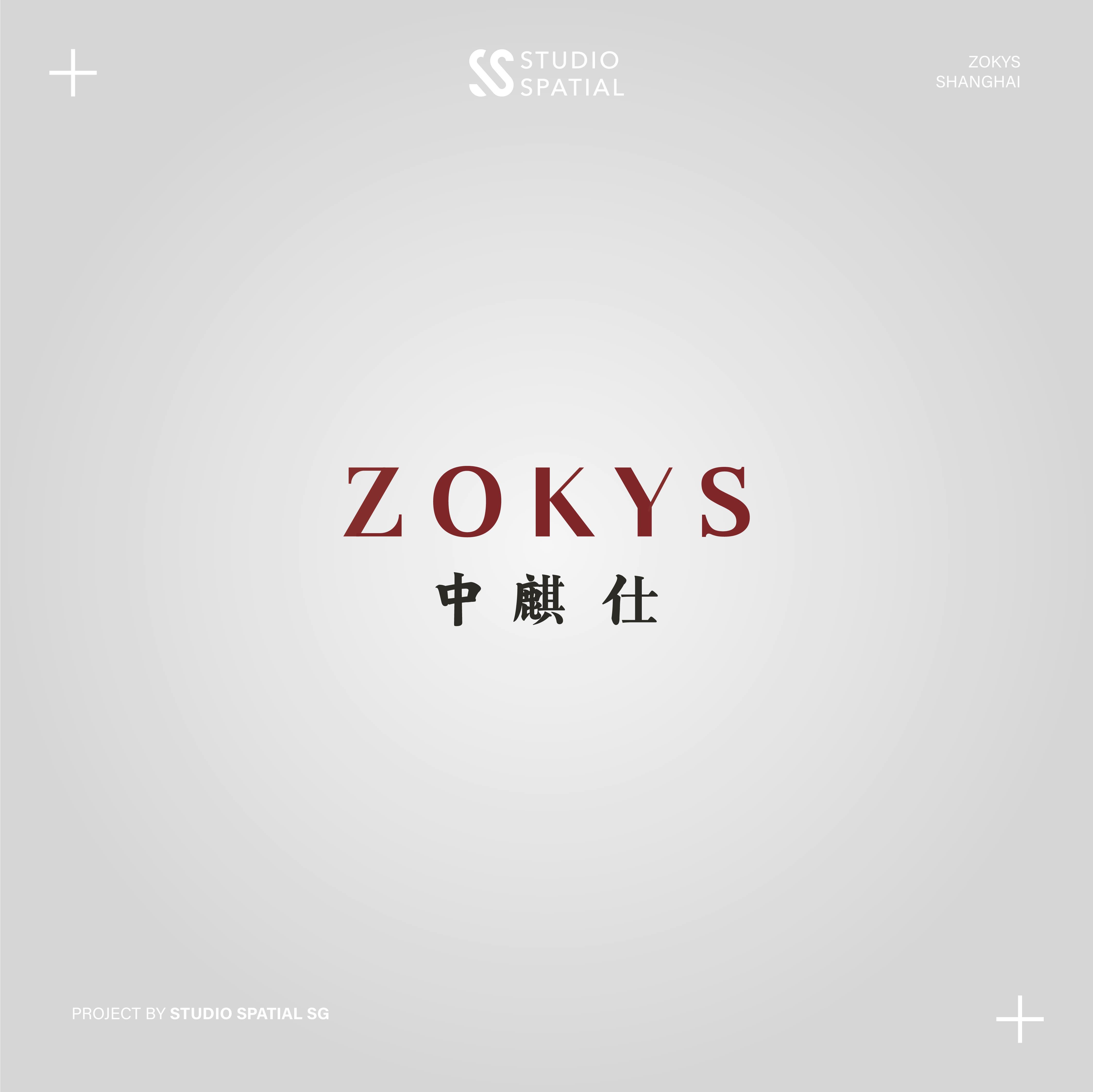
Through its name and logo, ZOKYS communicates its commitment to creating lighting solutions that blend heritage and cutting-edge technology. It reflects the company’s unique position in the architectural lighting industry—delivering designs that honor tradition, push boundaries, and illuminate the way forward.